
Why it works
Before we even get into the copy on this one (spoiler alert: it's an absolute banger), we should give props to Allday and Paynter for everything about this collab.
It's on-brand for two brands that are all about reducing waste. (Allday Goods say their mission is about "getting a handle on waste". Love that.)
The knives are obviously awesome.
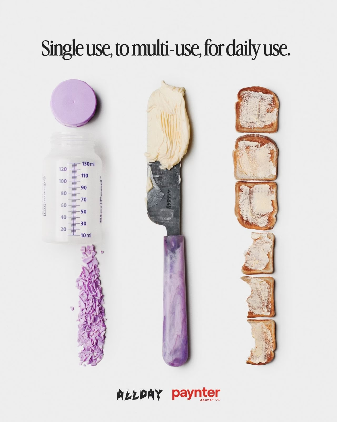
The whole thing was to raise money for NICU charities after the founders of Paynter stayed there with their newborn baby.
Oh! And the knife was a butter knife because mums are given a piece of toast as the first thing they eat after giving birth.
Every detail of this collab feels properly thought out and considered and mission-led. No notes.
Which is why it's also completely unsurprising that every one of the seven words in the headline is doing so much work as well.
How to steal it
We've all heard the advice that copywriting needs to be short, snappy and punchy.
And that's kinda true. Sometimes.
(Look, we're not going to spend a thousand words getting into it here properly, but writing needs to be as long or as short as it takes to get a reader interested and convinced with whatever you're selling. Sometimes that's 10 words. Sometimes it's 1000. We've got an axe to grind with that particular bit of copywriting advice, in case you hadn't guessed.)
But what is true is that if you're going to keep things short and snappy, you've got to really pack meaning into that line.
It can't just be a short but wishy-washy line. It needs to be a bottle rocket.
And in just 7 words, Allday Goods and Paynter manage to pack in so much information for the reader.
Obviously, taken as a whole, it's selling the journey and transformation of the product and underlining the reclamation and recycling big picture messaging of both brands. Love that.
But then when you break it down, it's doing so much more than that too.
Single use: first and foremost, this is the category language part. With two words, they're signalling that this is an eco-friendly product and immediately speaking directly to an audience that cares about that. Smart. But what's even smarter is that they're doing it in a way that co-opts the negative word (single use) and nudges the reader into that "oh yeah, I'm buying stuff that's better for the planet" mindset. It's not quite a category entry point (AKA, the situation where people decide to buy) but it's a nudge towards one, let's say that.
To multi-use: this is where the transformation part comes in. It's gone from single use to being something that you can use again and again because of this collab. That's clever on its own. There's a lot of virtue and ethics packed into that. But there's also the double-meaning. Sure, it's a butter knife. But you can use it for jam or cheese or even opening the post. There's a subtle "this is a handy little knife" message bubbling under the surface of this second clause. Smart.
For daily use: this is the payoff. This is the bit where all the process and eco-creds become tangible for the customer. This is a knife that you'll want to use every day. And part of the reason it's so important is because it takes something that's about the brand, product and process and makes it personal and real. It's the moment where the brand hands the knife over to the customers, essentially. The customer images using this knife for toast or cheese or whatever. (And getting customers to imagine using your product is huge for conversion.) Plus, emphasising daily usage helps lower price aversion too.
Oh, and it does it all with really grounded language too. There's no airy or floaty or marketing-y language here. Single use. Multi-use. Daily use. That's it. And because of that, it's more believable too.
And when you factor in that on a technical level they're using a load of rhetorical techniques to make this even stickier too?* Yeah, absolutely no notes.
* In just these 7 words, they've at least three of the the big Greek rhetorical devices:
Epistrophe (or epiphora), which is when the same word closes each clause. In this ad, it's "use" at the end of every clause.
Antithesis, which is where things are shown as opposite to each other. "single" against "multi" does that job here. It says "we're the opposite of single use plastics" on a technical level, too.
Isocolon, which is where you have parallel construction across the sentence. It makes things really sticky and memorable. We came, we saw, we conquered is a really good example of this. (I think, technically, the Allday x Paynter line is a tricolon crescens, since it builds to the most powerful idea.)
PS. Just realised we've just written 656 words of analysis on a 7 word headline. Wee bit excessive, but we got carried away.
See if your brand voice is ready for AI
Run your copy through our AI voice checker and find out whether a robot could write on-brand for you today.
Check your voice